Sunday, February 19, 2012

Book Arts and Offset Printing


Have you ever been curious about how offset printing works? So much of the printed material passing through our hands on a daily basis is printed on an offset press, yet small offset duplicators can also be a great tool for producing art and small editions of books or prints.

Offset printing has played an integral role in the small press movement producing chapbooks, flyers, posters and ephemera over the decades. As more and more small print shops are moving toward digital printing, offset duplicator presses are becoming available to artists, much in the same way that letterpress began to be available several decades ago.


This spring, the Oregon College of Art and Craft is offering a brand new, and entirely unique workshop opportunity that will provide a glimpse into what it takes to produce an offset printed edition using traditional and alternative techniques. Perfect for book artists, letterpress printers, and printmakers who are interested in learning about the technology of small presses and their potential for producing artwork.


Survey of Offset Lithography for Artists


Offset lithography in its current form has been around for close to a hundred years. Known primarily as an industrial production printing technique, offset printing (particularly the use of small format machines) has played an integral role in the history of independent art, design, and literary printing. Often perceived as being technically complex, this survey will help demystify this printing technique through classroom discussions and on-site shop visits. This four-day workshop will introduce students to the basic principles of offset lithography, touch on its social history as well as its use in the commercial printing industry, and provide an overview of machine function, manual image composition and plate making. Through hands-on exercises students will engage in mechanical image composition using both traditional and artistic techniques, and collaborate to produce a finished edition using those images, which will be printed at a local print shop.

You can learn more about the workshop Survey of Offset Lithography for Artists on OCAC's Community Programs page.

Friday, January 20, 2012

Combined Print Media Final Project

For the final Combined Print Media class students drew inspiration from the City of Portland's historic collection of records and documents. In November we trekked downtown to visit the Archives and Records center, where we got a chance to see some of the stacks and view some interesting historical pieces of ephemera from the city's extensive collection. City Archivist Diana Banning and Assistant City Archivists Brian Johnson and Mary Hansen gave us a wonderful tour and talk that introduced the class to the archives' holdings and their use.

The objective of the final project was to use the archives to research a topic of interest, and from there create a printed piece inspired by that research. Some of the students were inspired to make work which directly referred to their research, and others created work a bit removed from the original source, but in every case there is a germ of the original material evident.

Below are some snapshots of the results!

:::::::::::::

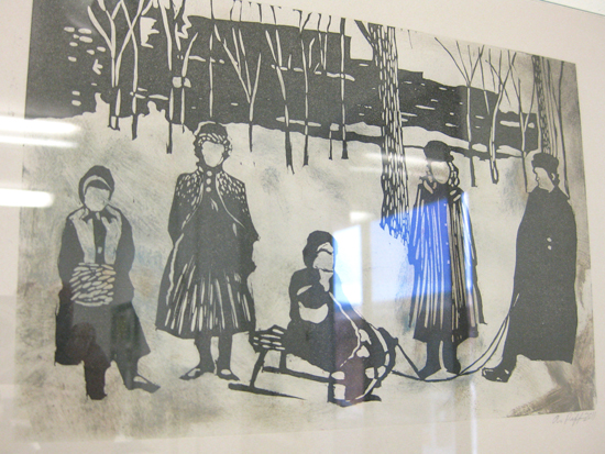
S. Swan became inspired looking into early street formation in downtown Portland. Early Portland city designers were interested in creating a walkable, 'human-scale' city, and the transformation occurred relatively fast. In a matter of years, Portland went from having a jumble of streets filled with tree stumps and potholes full of mud, to an organized and logically laid out grid.

Swan's work reflects her own experience walking in Portland, and captures the feeling of momentary glimpses and dislocated bits of information.


S. Swan
Untitled
Linocut, silkscren, photopolymer plates.

R. Bryant responded to a clipping from a Communist newsletter accusing the Portland police of setting up and instigating a crime in order to frame them. The Portland police claimed just the opposite, and well, fingers were pointed.

Bryant took the idea of finger pointing and the human desire to place the blame on the opposite party and rendered it in black and white. She made use of OCAC's ornament collection and found as many fingers and arrows as possible. It's interesting to think about how usually these ornaments are used to direct someone's attention to important information, yet in this case they simply reflect each other endlessly.


R. Bryant
Untitled
Letterpress printed ornaments, wood type, and sorts

M. Latham was inspired by photos from the Fire Bureau, and wanted to take on the challenge of rendering fire in print. Latham's humor is also evident in the title of this piece, which pokes at restaurant and 'foodie' culture always trying to outdo itself.

Latham did render this print four ways, blending techniques in a way that she wanted to hone from earlier assignments. It's difficult to tell in some places where one techniques ends and another begins.


M. Latham
Restaurant Fire, Four Ways
Acrylic drypoint, photopolymer plate, linocut, monoprinting

A. Piff was also inspired by a number of photographs from the collection. Portland used to employ a city photographer whose job it was to document development, construction, repairs, and catastrophes around the city. The photographer also captured minor events and slices of every day life of ordinary citizens.

Piff was particularly interested in those captured moments where, had they not been photographed, might have easily been forgotten Their documentation has leant them an air of importance in history. She was also interested in images that speak to what was important at the time they were taken, and how what we deem as important and document-worthy has changed over the years.


A. Piff
Untitled
Linocuts and hand-painting

E. Derge found an indignant letter to the editor that scolded the City of Portland for allowing a circus sideshow act to go on that included a lewd performance: belly-dancing! This inspired Derge to look into circus acts and their sideshows, which in turn led her to research medical oddities and developmental abnormalities. Fetus in Fetu is such an abnormality. I'm going to let readers do their own research on this one!


E. Derge
Fetus in Fetu
Letterpress printed using photopolymer plates, hand die-cutting, intaglio relief rolled plates, hand-built box.

B. Chavez found a historical scrapbook commemorating the flood of 1894. Her inspiration came not only from the object itself and the fact that such a scrapbook would have been made for such an event, but that it also contained a very poetic introduction.

Chavez reinterpreted the introduction, writing some of her own lines of poetry, and also interpreted the photography contained within the scrapbook by creating acrylic drypoints and binding them in between the slips words. The result is an elegant object responding to tragedy.


B. Chavez
A City Underwater
Handset type letterpress printed, acrylic intaglio, hand-bound book.

B. Sullivan initially researched the Benson Bubblers, and the man behind them, Simon Benson.

What you see here is not his response to that research...

...


B. Sullivan
Untitled
Silkscreen and inkjet printing.

R. Kapka found some official paperwork documenting animal acquisition at the zoo. Her response was amusement at the bureaucratic language and format of these documents, when we are so accustomed to the public face of the zoo and the more personal language we typically use when referring to animals. Her inspiration developed into an exploration of break-downs in communication, and exploring the areas where data intersects with the personal. Her piece forces the meeting of bureaucracy and absurdity, where the quotidian meets the bizarre.


R. Kapka
Untitled
Letterpress printed, handset type, photopolymer plate, hand-bound, foil-stamping

Wednesday, January 11, 2012

Objects and Obsessions

For the fourth Combined Print Media project, students explored the concept of obsessions, compulsions and fixations, while also thinking in terms of making their finished print work more "object-like."

This project turned out some of the best work of the semester, and the students certainly embraced the "obsessive" nature of the work.


R. Bryant
Untitled
Letterpress printed ornaments and sorts, layered and woven.
An exploration the OCAC type collection.


R. Kapka
Untitled
Letterpress printed halftones and linocuts, handset type and ornaments.
A unique set of trading cards.

M. Latham
Crush Collection
Letterpress printed using polymer plates and linocut, plus hand-drawing.
A catalog of fleeting obsessions.


E. Derge
Untitled
Letterpress printed using photopolymer plates, hand-cut and pinned.
Exercising control over fears by creating a personal collection.

B. Sullivan
Occupy Self
Cyanotype, letterpress printing using wood type, monoprinting.
A collection to be broken up and distributed.


B. Chavez
My Summer of Solitude
Handset type letterpress printed, hand-built wooden box.

S. Swan
Untitled
Linocut and photopolymer plates.
An accumulation that leads to anxiety.

A. Piff
Untitled
Hanset type, linocut, hand-built box, artifacts.
A collection of memories.

Tuesday, December 6, 2011

Combined Print Media Collaborative Project


For the Combined Print Media's third assignment of the semester, the class took on a collaborative project. Each year this assignment deals with a topic that is political or social in nature. This class chose to talk about separating "need" from "want." The discussion began around dissecting feelings of attachment to what we perceive as "needs," when in reality we can often get by without what we fall back on as requirements.

We become attached to our tools and materials, as well as material comforts that we feel help us or inspire us. But what do we truly need? What are our base requirements, and how can we parse the difference between compulsion and compulsory.

Each student created a list of 40 'things' in their lives that they routinely think of as needs, which in reality they could probably live without. These things aren't necessarily material objects. We often feel dependent on feelings, approval, medical intervention...discussions revolved around these necessities. From this list, everyone chose for themselves one item that they would keep, were they only allowed that one thing.

Everyone felt it was important that this piece not subscribe to preachiness, or communicate a sense of judgement. The desire for the needs we hold on to are both universal and personal.

The prints were made using a photopolymer plate from Boxcar Press, which was printed in two colors. Everyone carved an illustration of their "want" in linoleum. All of the prints were tiled and hung in the breezeway near the book arts studios at OCAC.

Wednesday, November 9, 2011

Speaking of Place

This fall the Combined Print Media class has been hard at work in the print studio. This class encourages integrating print methods in a way that allows for a deeper understanding of the materials, while making inquiries into subjects and ideas. The students have been doing a great job of combining conceptual development with the exploration of technique.

The second project of the semester was an investigation of place. Whether that was reflected in a more traditional landscape or a more conceptual idea of place, or something in between, was up to the student.

Ruby Kapka gave us two ways of looking at a section of her personal landscape, her kitchen and the objects contained within it. Her print is reminiscent of a kind of quasi-cultural anthropological exploration of personality, place, and taxonomy.


R. Kapka Kitchen: Dirty / Some Things From My Kitchen: Clean
Photopolymer intaglio, photopolymer relief, hand painting, handset type

Buzzy Sullivan explored an abstract landscape, which layered a haphazard background composed of elements from a magazine solvent transfer, with acrylic dry point and relief elements. This print pulls together elements of the random (solvent transfer) with the controlled (intaglio and relief printing).

B. Sullivan Untitled
Magazine solvent transfer, digital printing, acrylic dry point intaglio, handset wood type

Ruth Bryant's piece exposes an often overlooked or hidden away part of our personal landscape, the cat's eye view of the dust bunnies beneath the furniture. The rainbow roll using Akua water based inks really emphasizes the feeling of space, but plays with our expectations of light and shadow.

R. Bryant Untitled
Monotype rainbow roll, collograph, acrylic dry point intaglio

Brittany Chavez explored the both the physical and personal landscape of a specific street view in downtown Portland. She used very gestural brayer marks to suggest architecture and negative space, along with drawing and blind embossing to pull the elements together.

B. Chavez The Sunniest Morning
Monoprinting, graphite, linocut

Sienna Swan's landscape refers to memory associated with place. The highly graphic line work swirls around the figure to create an almost dreamscape atmosphere.

S. Swan Untitled
Collograph using hand cut papercut, linocut

Rather than creating a human-centric landscape, Erin Derge's print interprets the way whales perceive place. With just a few graphic devices, Erin's piece refers to both objective data collection, and to the personalization of mammals, place, and narrative.

E. Derge Untitled
Relief photopolymer and monoprinting

Michelle Latham created a landscape which lives somewhere in between representation and personal interpretation. Her subject is a specific intersection on the way up the hill to OCAC. She integrated relief methods and intaglio in a way that really captures this degraded, erosion-prone area of Portland's west hills.

M. Latham Burnside and Tichner
Linocut, acrylic dry point intaglio, monoprinting

Atika Piff created an exploration of place based on photographs and memories from her sister's apartment in China. She created a landscape out of separate pieces, broken and re-placed together to represent a landscape fractured by poor urban planning, excess, and neglect.


A. Piff Haphazardly Condensed
Monotype, photopolymer intaglio, handset type